Legibility / contrast warning is displayed in wrong situations #14687
Comments
|
Discussed on WordPress.org Slack (requires registration) as well: |
|
Hi @draganescu I do not understand why we need the following lines of code gutenberg/packages/block-library/src/paragraph/edit.js Lines 228 to 230 in 359858d Specifically, if we have these lines, when we change the background color of the block to dark blue (secondary color), the text color will be automatically changed to white, I do not understand why we should change the text color. 
|
|
@Jackie6 It is a nice feature that helps with making sure we have default accessibility ON, that is it prevents mistakes of default black text on dark blue background. |
|
@draganescu I agree it is a nice feature. But I do not find any documentation about this feature. Do you know it? Or maybe we could write a doc for this feature. Because I think this design especially these lines of code is a little confusing at first glance. |
|
I am removing the 'User Experience (UX)' label as part of a label cleanup. It's not being used anymore consistently so let's try and keep to 'needs design' and 'needs design feedback'. If we find a need for another label we can consider it but having those 2 should cover this. |
|
After reviewing this issue in the design slack triage today, I'm noticing a number of bugs. I'll add some screenshots to help visualize the problems.
|

|
Looks to me like the logic behind when to display a contrast warning needs some help. And some of the wording in the messages needs refining. Do we have a list of the messages anywhere so I can review them all, @draganescu ? |
|
Tested again and with the new color controls on paragraphs and other blocks (also tested the cover block) this does not seem to be a problem anymore. |
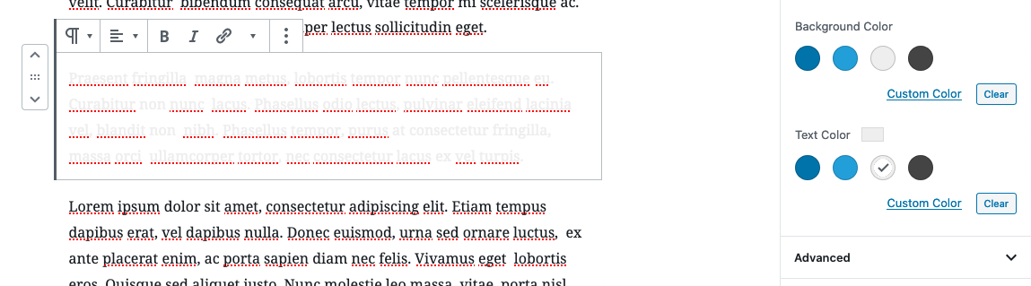
Describe the bug
When a Paragraph block is added and from colour settings we pick a dark colour, we can see the contrast warning even if the contrast is fine. If we also pick a light text colour the warning disappears.
At the same time, when a Paragraph block is added and from colour settings we pick a light text colour the poor contrast warning doesn't show unless we also pick a light bg colour.
The problem in sum seems to be that for the contrast warning to work properly both the bg and the text colours must be picked.
To Reproduce
Steps to reproduce the behavior:
Expected behavior
The contrast warning work as the eye does, when we see light text on light background, not depending on what properties the block has selected.
Screenshots
If applicable, add screenshots to help explain your problem.
Desktop (please complete the following information):
Additional context
The text was updated successfully, but these errors were encountered: