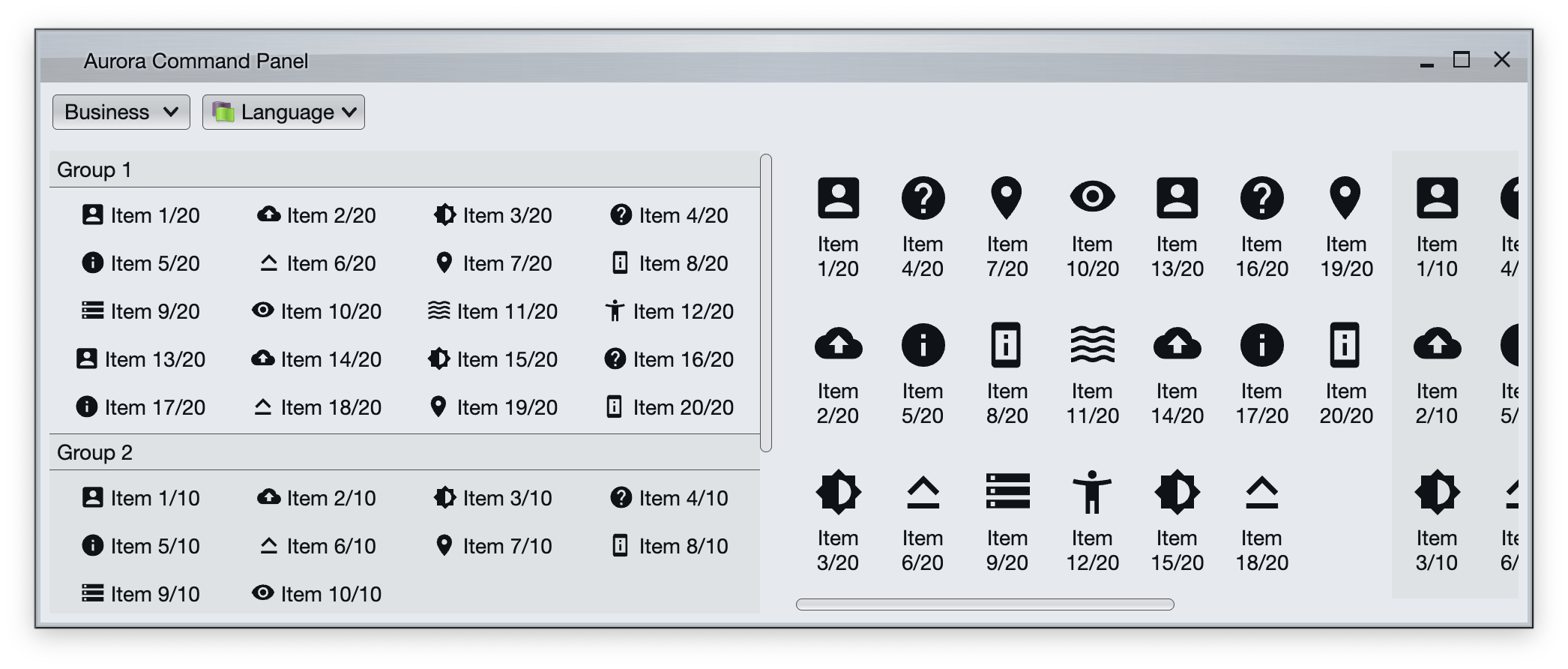
Command panel is a two-dimensional grid of logically and visually grouped commands (and their projections). In the screenshot we can see two command panels.
The panel on the left arranges commands in rows. When we don't have any more horizontal space in the current row, we start a new row. Each command group displays a title, and we kick in vertical scrolling of the overall content when necessary.
The panel on the right arranges commands in columns. When we don't have any more vertical space in the current column, we start a new column. We kick in horizontal scrolling of the overall content when necessary.
CommandPanelContentModel is the content model for command panels. It is constructed from a list of CommandGroup objects which effectively serve as content models for each individual command group. In addition, the optional commandActionPreview attribute can be set to specify the action preview object that will be triggered for all commands in the panel.
CommandPanelPresentationModel is the presentation model for command button panels.
The layoutSpec attribute can be used to specify whether the button content of each group should be laid out horizontally or vertically:
PanelLayoutSpec.RowFillarranges the buttons in each group by rows, and kicks in vertical scrolling of the overall panel content when needed.PanelRowFillSpec.Fixedis used to have a fixed number of columns (buttons in each row).PanelRowFillSpec.Adaptiveis used to specify the minimum column width for adaptive layout that scales the number of columns with available horizontal space.
PanelLayoutSpec.ColumnFillarranges the buttons in each group by columns, and kicks in horizontal scrolling of the overall panel content when needed.PanelColumnFillSpec.Fixedis used to have a fixed number of rows (buttons in each column).PanelColumnFillSpec.Adaptiveis used to specify the minimum row height for adaptive layout that scales the number of rows with available vertical space.
The showGroupLabels attribute is only relevant when layoutSpec is PanelLayoutSpec.RowFill. When set to true, button groups show titles.
The commandPresentationState attribute determines the visual presentation of the commands in the projected buttons. When the presentation state is set to one of the XYZFitToIcons, use commandIconSize to control the icon size for the projected buttons.
CommandButtonPanelProjection is the projection that combines CommandPanelContentModel content model and CommandPanelPresentationModel presentation model. The result of its project function is a command button panel composable.
First we create a generic function that gets group sizes (how many groups are there, and how many commands to have in each group) and returns a CommandPanelContentModel object populated with sample commands:
fun getCommandPanelContentModel(
    resourceBundle: State<ResourceBundle>,
    vararg groupSizes: Int
): CommandPanelContentModel {
    val icons = arrayOf(
        accessibility_new_24px(),
        account_box_24px(),
        backup_24px(),
        brightness_medium_24px(),
        help_24px(),
        info_24px(),
        keyboard_capslock_24px(),
        location_on_24px(),
        perm_device_information_24px(),
        storage_24px(),
        visibility_24px(),
        waves_24px()
    )

    val groupMf = MessageFormat(resourceBundle.getString("Group.title"))
    val commandMf = MessageFormat(resourceBundle.getString("Group.entry"))

    val commandGroups = arrayListOf<CommandGroup>()

    var groupIndex = 1
    for (groupSize in groupSizes) {
        val commandList = arrayListOf<Command>()
        for (index in 1..groupSize) {
            commandList.add(
                Command(
                    text = commandMf.format(arrayOf<Any>(index, groupSize)),
                    action = { println("test $index/$groupSize activated!") },
                    icon = icons[index % icons.size]
                )
            )
        }
        val group =
            CommandGroup(title = groupMf.format(arrayOf<Any>(groupIndex)), commands = commandList)
        commandGroups.add(group)
        groupIndex++
    }

    return CommandPanelContentModel(commandGroups = commandGroups,
        commandActionPreview = object : CommandActionPreview {
            override fun onCommandPreviewActivated(command: Command) {
                println("Action preview activated for ${command.text}!")
            }

            override fun onCommandPreviewCanceled(command: Command) {
                println("Action preview canceled for ${command.text}!")
            }
        }
    )
}
Now we can create a presentation model with PanelLayoutSpec.RowFill layout fill mode and project a sample command panel:
CommandButtonPanelProjection(
    contentModel = commandPanelContentModel.value,
    presentationModel = CommandPanelPresentationModel(
        layoutSpec = PanelLayoutSpec.RowFill(PanelRowFillSpec.Fixed(5)),
        showGroupLabels = true,
        backgroundAppearanceStrategy = BackgroundAppearanceStrategy.Flat,
        commandPresentationState = CommandButtonPresentationState.Medium,
        iconActiveFilterStrategy = IconFilterStrategy.ThemedFollowText,
        iconEnabledFilterStrategy = IconFilterStrategy.ThemedFollowText
    )
).project()
This creates a command panel that:
- Shows group labels
- Has exactly five columns of buttons
- Each button in
Mediumpresentation state - With icons in active and enabled states using the color of the text
Or another presentation model with PanelLayoutFillMode.ColumnFill layout fill mode and project another command panel:
CommandButtonPanelProjection(
    contentModel = commandPanelContentModel.value,
    presentationModel = CommandPanelPresentationModel(
        layoutSpec = PanelLayoutSpec.ColumnFill(PanelColumnFillSpec.Fixed(6)),
        showGroupLabels = false,
        backgroundAppearanceStrategy = BackgroundAppearanceStrategy.Flat,
        commandPresentationState = CommandButtonPresentationState.Big,
        iconActiveFilterStrategy = IconFilterStrategy.ThemedFollowText,
        iconEnabledFilterStrategy = IconFilterStrategy.ThemedFollowText
    )
).project()
This creates a command panel that:
- Has exactly six rows of buttons
- Each button in
Bigpresentation state - With icons in active and enabled states using the color of the text
Continue to breadcrumb bar.