Color picker improvements, first round #2680
Conversation
 afercia
added
the
[Focus] Accessibility (a11y)
afercia
added
the
[Focus] Accessibility (a11y)
Codecov Report
@@            Coverage Diff             @@
##           master    #2680      +/-   ##
==========================================
- Coverage   33.77%   33.74%   -0.03%
==========================================
  Files         191      191
  Lines        5691     5695       +4
  Branches      996      997       +1
==========================================
  Hits         1922     1922
- Misses       3189     3192       +3
- Partials      580      581       +1
Continue to review full report at Codecov.
|

|
Screenshots to illustrate the interaction with Safari + VoiceOver:
when clicking:
when clicking again:
selected state:
|


blocks/color-palette/index.js
Outdated
| <Popover | ||
| isOpen={ this.state.opened } | ||
| onClose={ this.closePicker } | ||
| onClose={ this.closeOnClickOutside } |
There was a problem hiding this comment.
As of deb86a7, Popover's onClose callback no longer passes the click event, since there can be many reasons a Popover might emit a close intent. The change here should be simply to change onClose={ to onClickOutside={
I expect you may need to git rebase origin/master and force push the branch for this to take effect, since #2697 was merged to master after your branch was created.
blocks/color-palette/index.js
Outdated
| ref={ this.bindToggleNode } | ||
| aria-label={ __( 'Custom color picker' ) } | ||
| > | ||
| <span className="blocks-color-palette__custom-color-gradient"></span> |
There was a problem hiding this comment.
Minor: For brevity, React allows you to self-close tags: <span /> (Edit: I see this was written as such below, so more for consistency).
blocks/color-palette/index.js
Outdated
| className={ className } | ||
| style={ style } | ||
| onClick={ () => onChange( value === color ? undefined : color ) } | ||
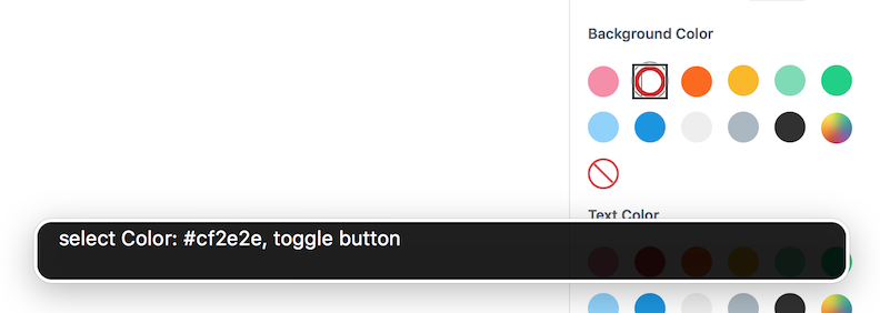
| aria-label={ sprintf( __( 'Color: %s' ), color ) } | ||
| aria-current={ value === color && __( 'Selected color' ) } | ||
| aria-pressed={ value === color ? true : false } |
There was a problem hiding this comment.
The ternary shouldn't be necessary here, and can be simplified to value === color (will always be true or false)
blocks/color-palette/index.js
Outdated
| <Popover | ||
| isOpen={ this.state.opened } | ||
| onClose={ this.closePicker } | ||
| onClose={ this.closeOnClickOutside } | ||
| onClick={ this.stopPropagation } |
There was a problem hiding this comment.
Can you explain the need for stopping propagation here?
There was a problem hiding this comment.
Hm not 100% sure given the time passed, I think clicking anywhere on the ChromePicker (custom color) closed the popover but seems something has changed in the meantime (can't confirm). Will remove.
afercia
force-pushed
the
update/color-picker-a11y-valid-code
branch
from
f3c58b5 to
bc81f6b
Compare
|
Updated and rebased. But I'm seeing a new CSS glitch in Safari 11, where the rounded focus style on the color buttons is not equally centered. Investigating.
|

|
@aduth any specific reason for this rule: seems a bit weird to me this actually can make any relevant difference: |
|
The alignment issue in Safari 11 is solved in 0503875. Any objections to merge? |
Like rules on spacing within parentheses, it's merely a style convention aimed at encouraging consistency. I would be glad to add these to the coding guidelines document but... the current atmosphere leads me to believe that it would be unwise to be codifying our React usage patterns at this point in time 😬 (Will follow-up with a final review) |
|
Also, in case you're not already using one and are interested, there are a number of editor integrations to surface ESLint issues before it reaches CI: https://eslint.org/docs/user-guide/integrations |
|
thanks! |
This PR tries to address a first round of improvements to the Color picker buttons.
Fixes #2679