fix(AutoComplete): add missing style to ensure alignment #52819
Conversation
|
|
|
|

👁 Visual Regression Report for PR #52819 Failed ❌
Important There are 6 diffs found in this PR: 🆕
|


WalkthroughThis pull request addresses a bug fix by removing an unnecessary CSS style that set a fixed height for the selection search input in the Select component. This change ensures that the input height is not explicitly defined, potentially allowing for more flexible styling and layout. Changes
|
![petercat-assistant[bot]](https://avatars.githubusercontent.com/in/875736?s=60&v=4)
More templates
commit: |
Bundle ReportChanges will increase total bundle size by 156 bytes (0.0%) ⬆️. This is within the configured threshold ✅ Detailed changes
Affected Assets, Files, and Routes:view changes for bundle: antd.min-array-pushAssets Changed:
|
Codecov ReportAll modified and coverable lines are covered by tests ✅
Additional details and impacted files@@ Coverage Diff @@
## master #52819 +/- ##
=========================================
Coverage 100.00% 100.00%
=========================================
Files 769 769
Lines 13864 13864
Branches 3633 3633
=========================================
Hits 13864 13864 ☔ View full report in Codecov by Sentry. |
| @@ -93,10 +93,6 @@ function genSizeStyle(token: SelectToken, suffix?: string): CSSObject { | |||
| alignItems: 'center', | |||
| padding: `0 ${unit(inputPaddingHorizontalBase)}`, | |||
|
|
|||
| [`${componentCls}-selection-search-input`]: { | |||
There was a problem hiding this comment.
这个不对,AutoComplete 和 Select 是共用样式的。Select 里是对的:

要看一下 AutoComplete 为什么会不一致
There was a problem hiding this comment.

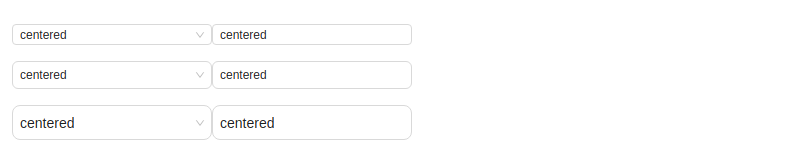
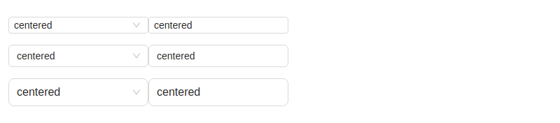
不一致的原因在于:非combobox mode下,会多一个item dom,把selector的高度撑起来了。而AutoComplete没有这个dom,又显式设定了height,导致large size下没居中
![accesslint[bot]](https://avatars.githubusercontent.com/in/1502?s=60&v=4)
| <Radio.Button value="middle">middle</Radio.Button> | ||
| <Radio.Button value="large">large</Radio.Button> | ||
| </Radio.Group> | ||
| <Select defaultValue={'centered'} size={size} style={{ width: 200 }} /> |
There was a problem hiding this comment.
Looks like this element is missing an accessible name or label. That makes it hard for people using screen readers or voice control to use the control.
| <span | ||
| class="ant-select-selection-search" | ||
| > | ||
| <input |
There was a problem hiding this comment.
Looks like this element is missing an accessible name or label. That makes it hard for people using screen readers or voice control to use the control.
| <span | ||
| class="ant-select-selection-search" | ||
| > | ||
| <input |
There was a problem hiding this comment.
Looks like this element is missing an accessible name or label. That makes it hard for people using screen readers or voice control to use the control.
| <Flex vertical gap={16}> | ||
| {(['small', 'middle', 'large'] as const).map((size) => ( | ||
| <Flex key={size}> | ||
| <Select |
There was a problem hiding this comment.
Looks like this element is missing an accessible name or label. That makes it hard for people using screen readers or voice control to use the control.
| <span | ||
| class="ant-select-selection-search" | ||
| > | ||
| <input |
There was a problem hiding this comment.
Looks like this element is missing an accessible name or label. That makes it hard for people using screen readers or voice control to use the control.
| <span | ||
| class="ant-select-selection-search" | ||
| > | ||
| <input |
There was a problem hiding this comment.
Looks like this element is missing an accessible name or label. That makes it hard for people using screen readers or voice control to use the control.
| <span | ||
| class="ant-select-selection-search" | ||
| > | ||
| <input |
There was a problem hiding this comment.
Looks like this element is missing an accessible name or label. That makes it hard for people using screen readers or voice control to use the control.
| <span | ||
| class="ant-select-selection-search" | ||
| > | ||
| <input |
There was a problem hiding this comment.
Looks like this element is missing an accessible name or label. That makes it hard for people using screen readers or voice control to use the control.
| <span | ||
| class="ant-select-selection-search" | ||
| > | ||
| <input |
There was a problem hiding this comment.
Looks like this element is missing an accessible name or label. That makes it hard for people using screen readers or voice control to use the control.
| <span | ||
| class="ant-select-selection-search" | ||
| > | ||
| <input |
There was a problem hiding this comment.
Looks like this element is missing an accessible name or label. That makes it hard for people using screen readers or voice control to use the control.
Co-authored-by: afc163 <afc163@gmail.com>
Signed-off-by: Jony J <1844749591@qq.com>
 aojunhao123
changed the title
aojunhao123
changed the title
🤔 This is a ...
🔗 Related Issues
💡 Background and Solution
Before

After

📝 Change Log